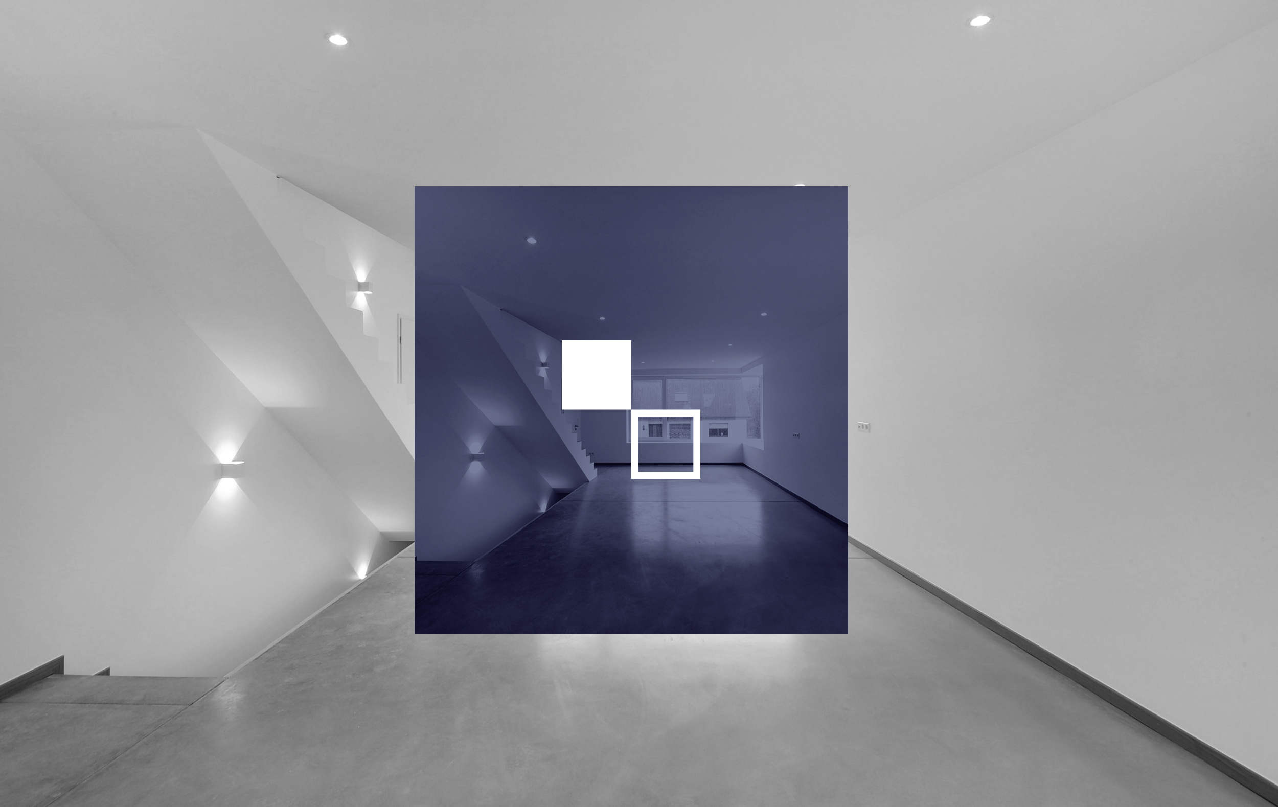
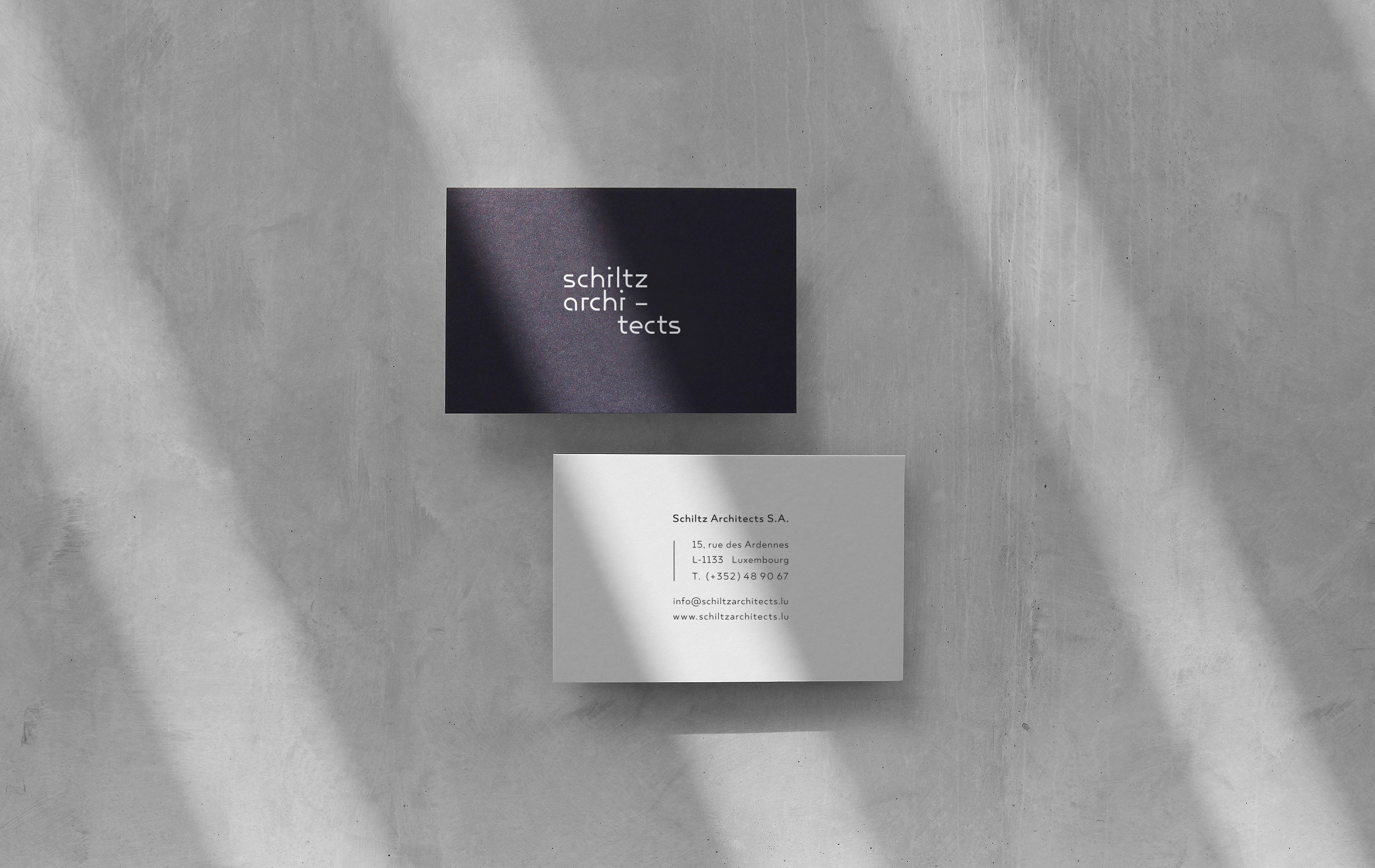
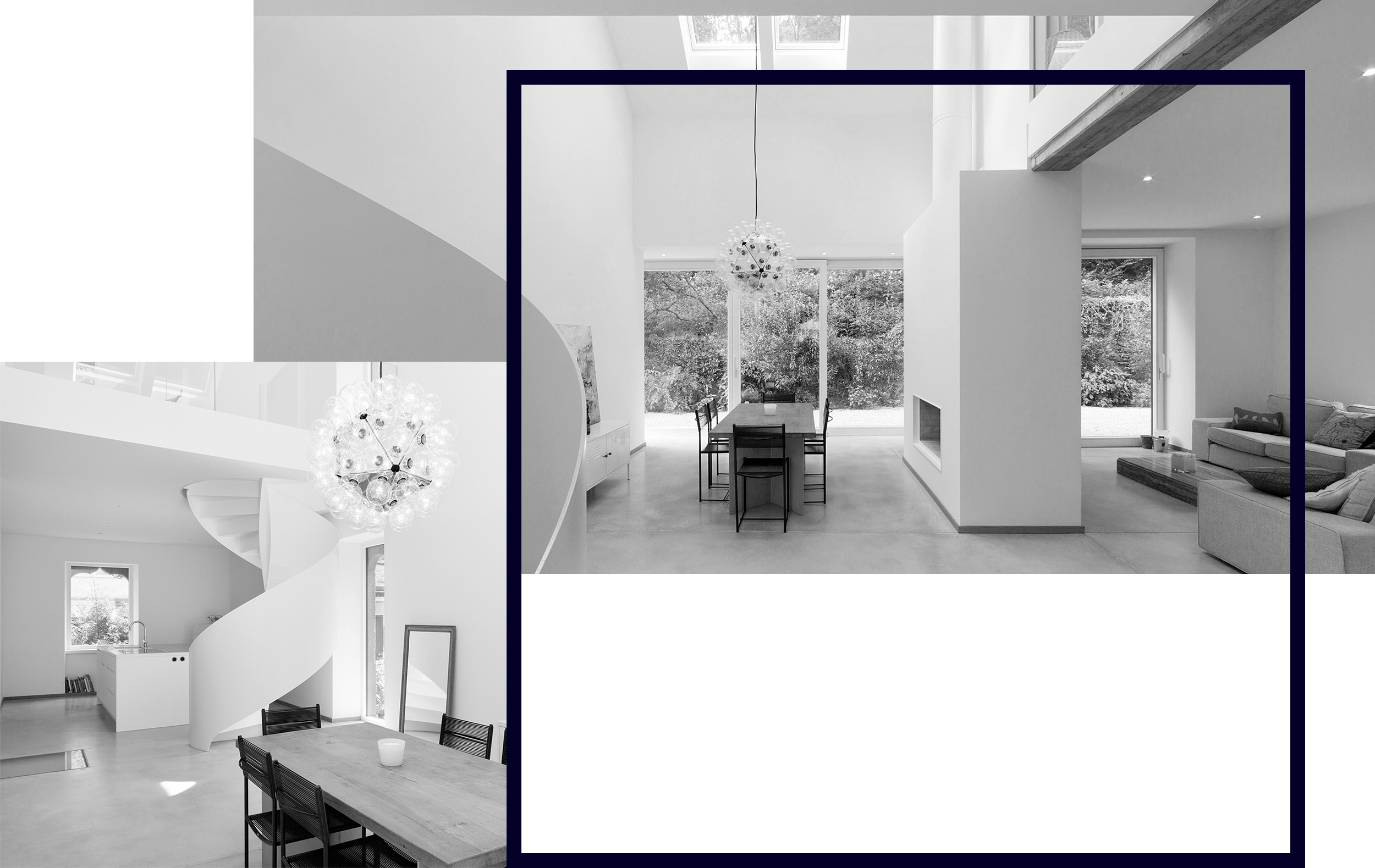
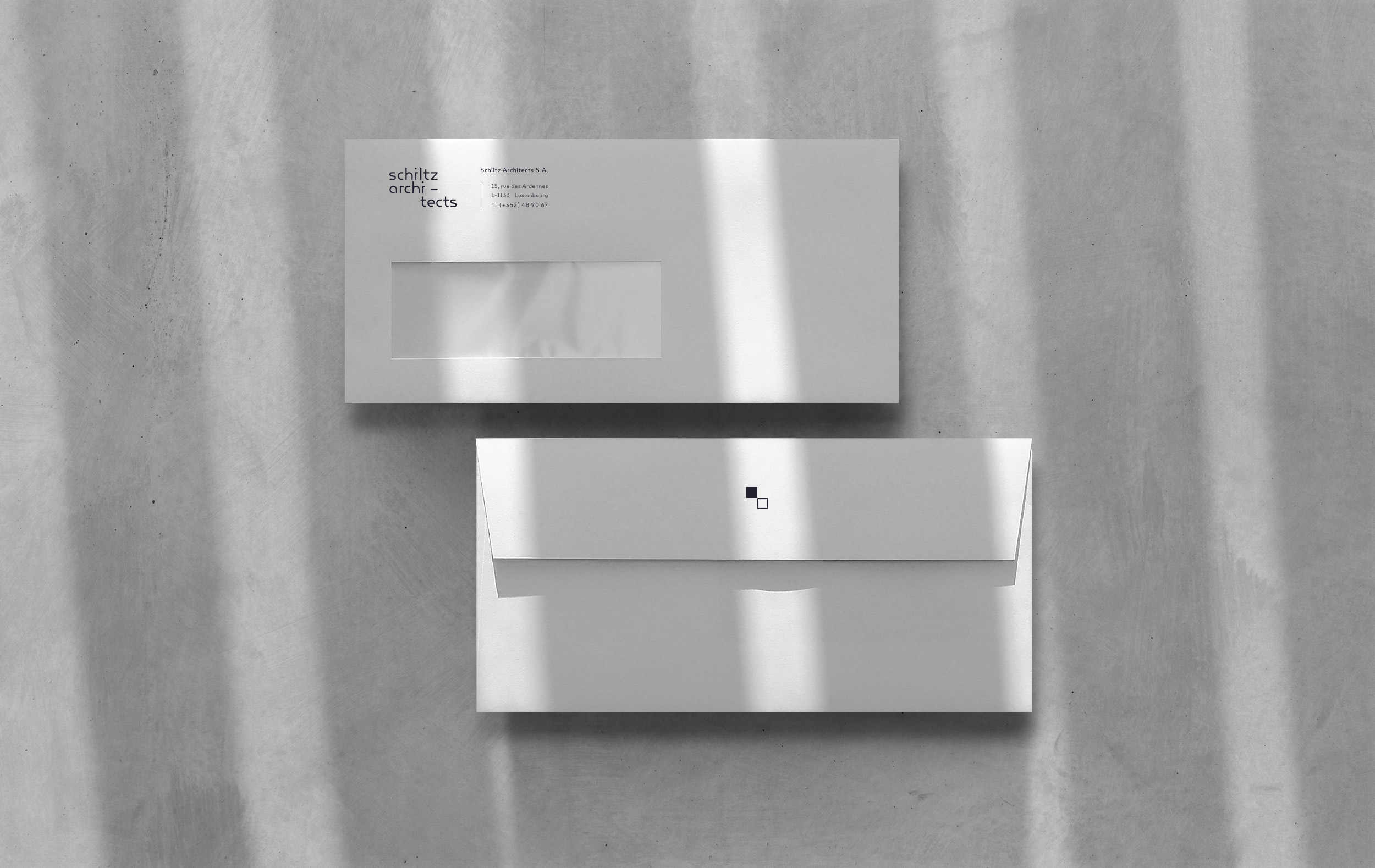
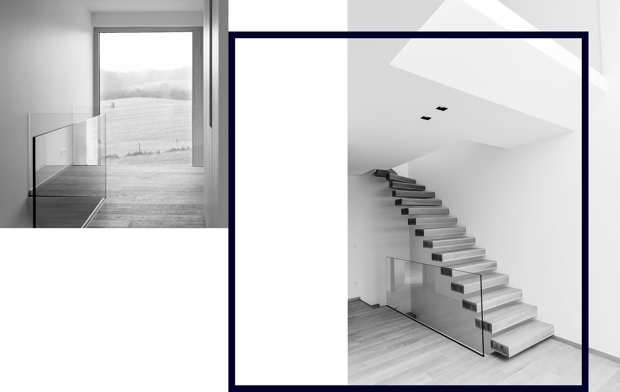
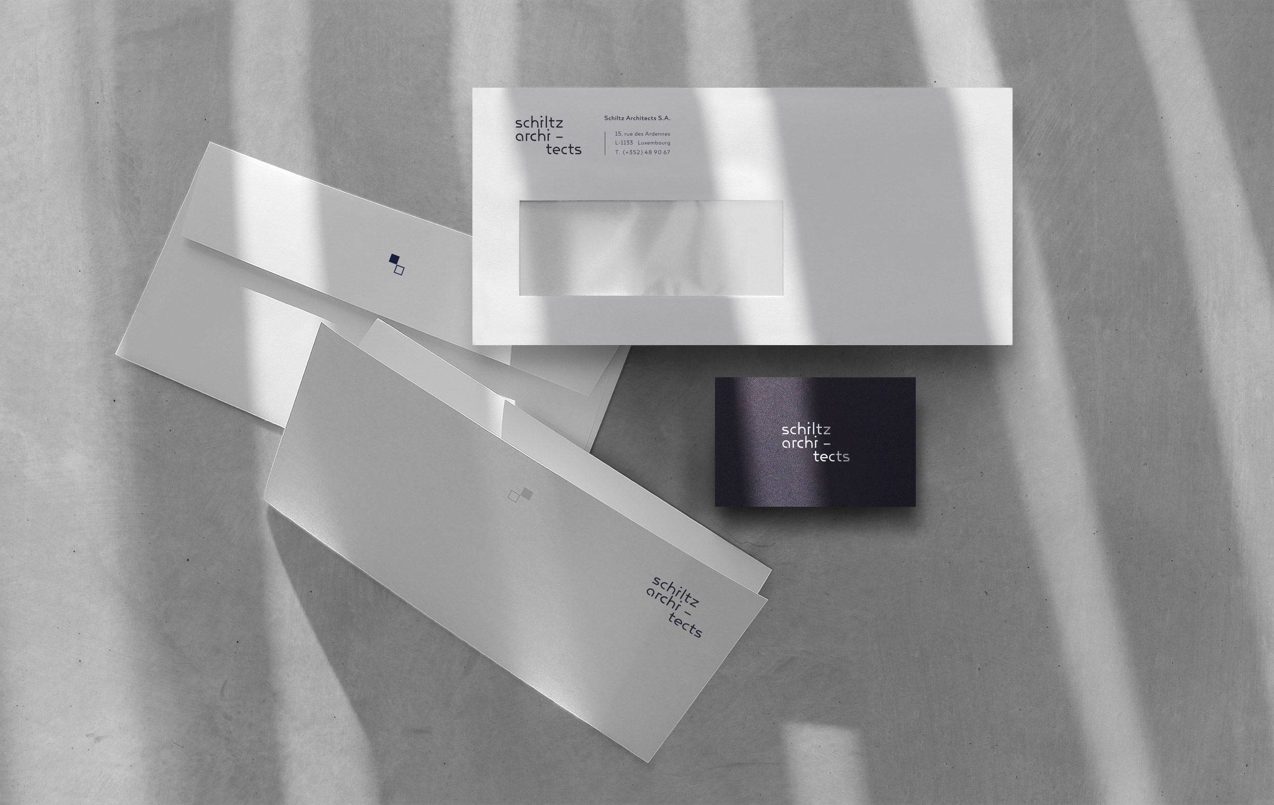
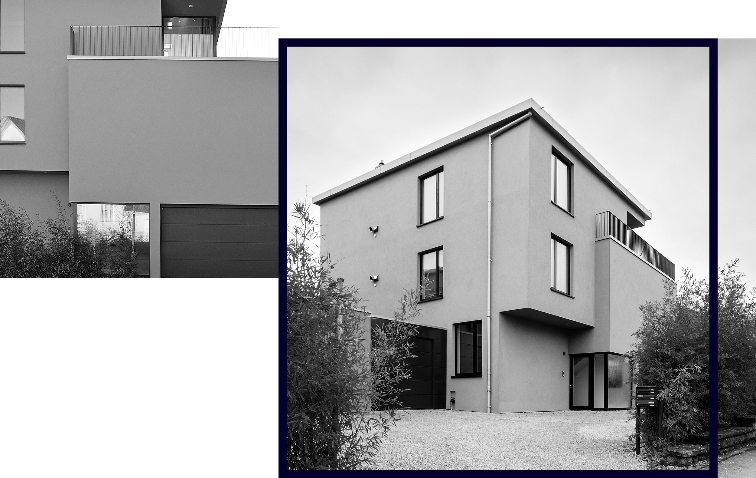
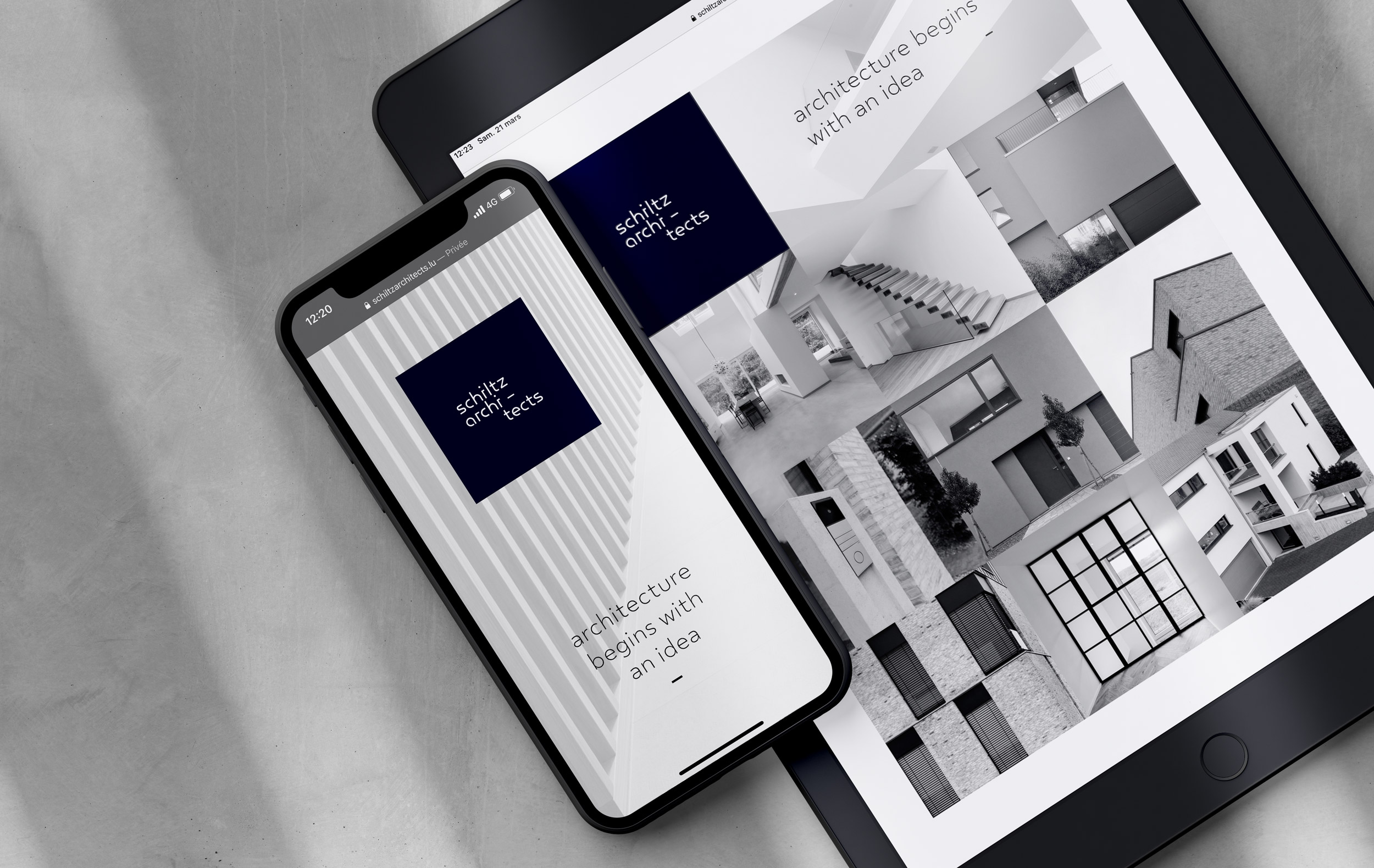
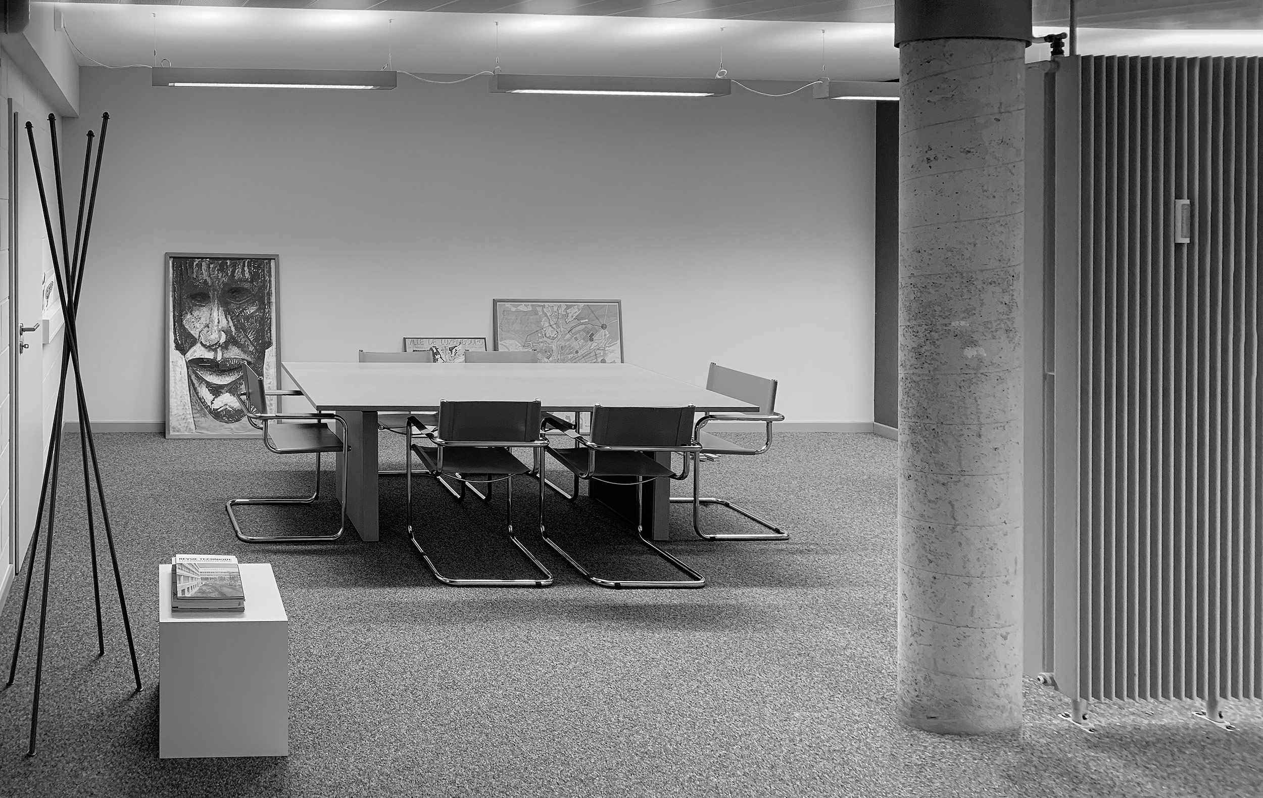
Schiltz Architects is an architectural and engineering firm specializing in the development of high quality, elegant and sustainable homes. Light is the key element in each of their constructions. We wanted to highlight this philosophy by working on black and white photos and the group’s identity in an almost black blue.
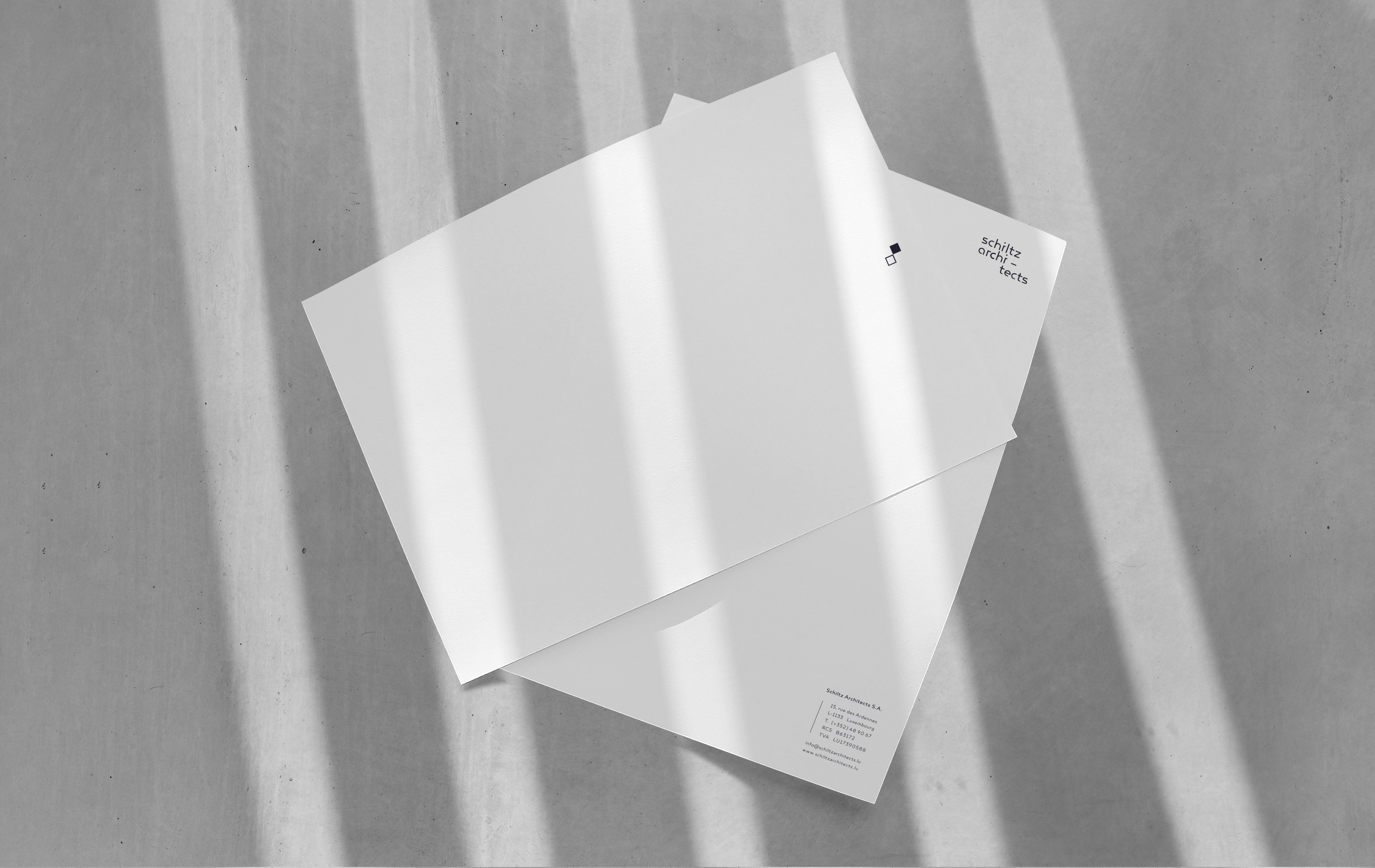
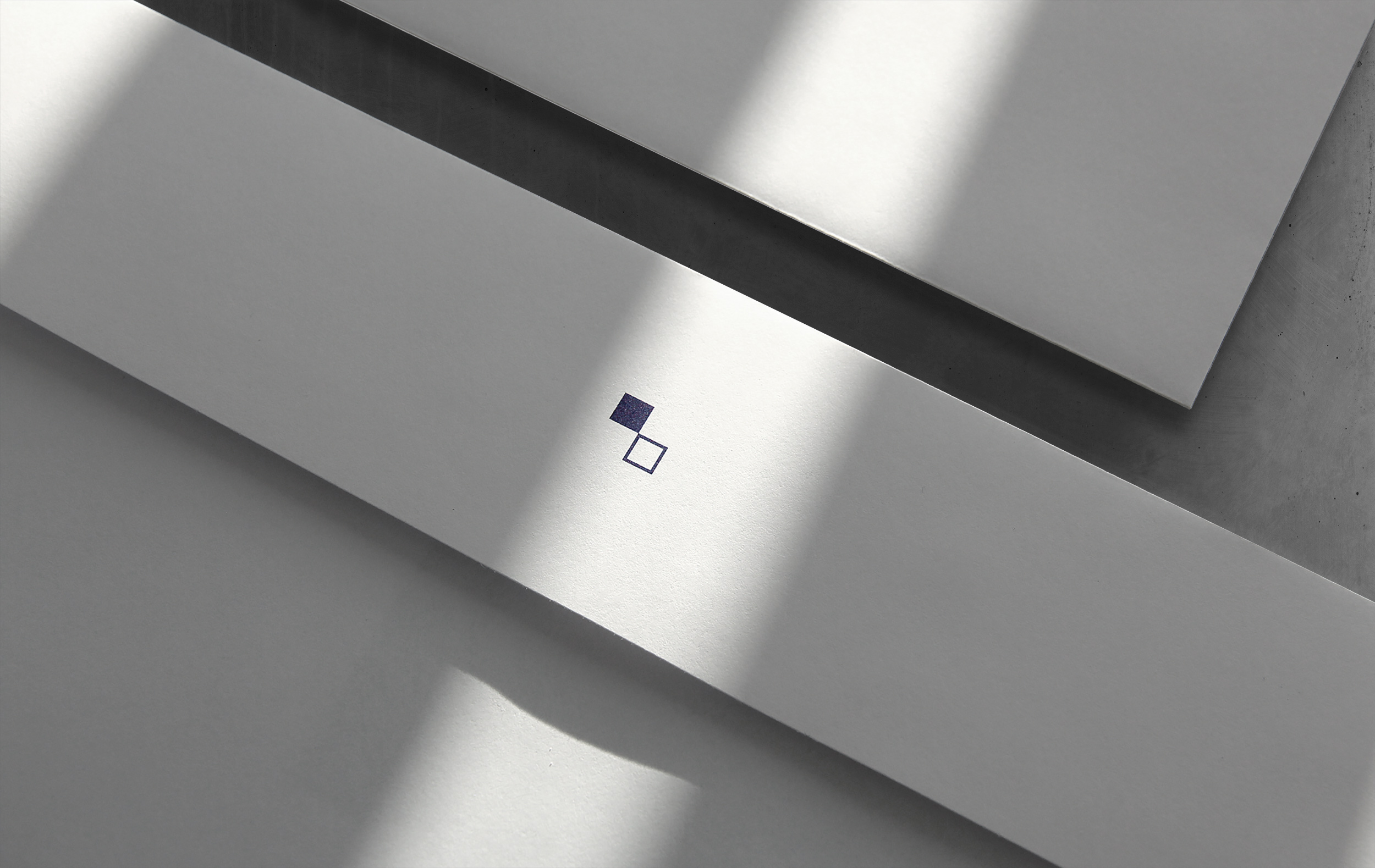
The play of destructuring and cutting of the logo reflects the idea of destruction and construction, the randomness of architecture. As for the two minimalist cubes, symbols of the graphic identity, they embody the relationship between the two-tone, full/empty space and its evolution over time.
Website: www.schiltzarchitects.lu
What we did:
Branding
Editorial design
Web design
Web development
Photo: Tatiana Garcia ©